01 · Overview
Designing for AI legal teams actually trust
Legal teams used to read contracts one at a time to answer a single question. LinkAI lets them ask once and get the answer, with the exact clause shown. I led design end-to-end, from reframing a vague brief, through reworking what engineering had built, to a redesign that shipped to production.
- →Shipped to production. Legal users now ask one question instead of reading every contract.
- →The way the AI cites its sources became how every new AI feature in LinkSquares explains its answers.
- →Engineering pushed back, worried about token usage. One user interview changed their minds.
02 · Problem
A vague brief without a defined user need
I was asked to design a feature called "Custom AI Values," a way for LinkSquares' AI to extract answers from contracts that didn't exist as structured data. The brief was vague. The team knew it involved AI extraction and that the results would become searchable, but nobody could articulate what the top use case actually was.
Business need
Defined
Create custom AI-extracted values from contracts that become permanent, searchable fields in the system.
User need
Unknown
What problem does this actually solve for the person using it? Why would they do this?
03 · Discovery
The POC was built around the wrong assumption
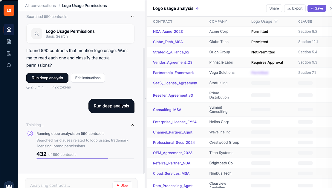
Without a clear use case, engineering built around their own guess: users would want to save custom AI values as permanent searchable fields. The version they built put saving first. Six steps stood between a user and an answer: ask, search, confirm extraction, edit instructions, review five previews, give feedback on each. Before a single result hit the screen.
Engineering proof of concept
Finding the real use case
I ran a demo of the POC with our internal legal team. The tool had a ton of usability issues, but buried in that meeting was the moment that changed everything. Someone on legal asked about logo usage permissions across their contracts. Their reaction to the multi-step flow was immediate.
"Which companies permit the use of their logo? I just want my damn answer."
Internal legal team, during POC demo
That reframed the whole problem. Engineering had designed for saving. Users needed the answer first. The save could come after, if they even wanted it.
Business need
Defined
Create custom AI-extracted values from contracts that become permanent, searchable fields in the system.
User need
Defined ✓
Ask a natural language question about my contracts and get the answer. Let me save it later if I need to.
04 · Process
Designing within the constraints we inherited
My audit of the existing build came back with three problems.
Language
Engineering terms (extract, value, instructions) where legal users think in legal terms.
Flow
Five setup steps before a single result hit the screen.
Trust
No way to see how the AI got its answer, which legal can't ship without.
The team had months in the existing build. Scrapping it would slip the AI roadmap. So the redesign had to keep the backend and only change what users saw. I mapped what was movable with the lead engineer and data scientist.
Two changes drove the most discussion. We cut the "preview five examples" step: the data scientist confirmed the model could classify scope on its own, which made the gate redundant. And we moved from batch results to streaming with a stop button, which addressed engineering's cost concern and gave users a sense of progress.
What I changed
✕
Answer first, save later. Flipped the flow so users see results before being asked to configure anything.
✕
Cut the 5-preview review step. The model could handle scope on its own; the user shouldn't have to.
✕
Streaming results with a stop button. Users see progress as it runs; engineering keeps its cost control.
05 · Outcome
Testing with real users
With the redesigned prototype, I ran usability tests with three external legal professionals. The scenario: marketing pings legal because the website has logos from companies who aren't even customers anymore. They need to know which logos they can use, by end of day.
Study participants
P1
In-house legal counsel
Familiar with AI search tools (Copilot)
P2
In-house legal, small team
Mid-sized org, amendments and supplementary agreements
P3
In-house legal, enterprise
70,000-person company, 150-person legal team
The good news: the renamed two-mode search landed. All three participants understood the distinction between "basic search" and "deep analysis" immediately, and saw the value in having both options.
"Having the two options is very useful because it depends on what I'm looking for.", P2
But I also learned things I wasn't expecting.
Key findings
Data mismatches destroyed trust instantly
All three participants independently cross-referenced the AI's stated counts against the results table. Any mismatch killed their confidence immediately. One participant rated trust at 2 out of 5.
"I would need to go back to the source contracts to cross-check before acting on anything."
Updating overwrote previous results, and users hated it
Users wanted to refine their prompts without losing what they'd already found. The current flow just replaced everything with no version history.
"I will actually lose the first set of results. I'm not quite sure how I feel about that." , P1
"It would be good if you could make a copy and modify that copy... save that as a separate prompt instead of replacing the original one.", P2
"Save" meant three different things to three different people
P1 expected it to save the full chat thread, like Copilot. P2 expected it to save results for future retrieval. P3 expected a file download. The actual behavior matched none of them.
"It's pretty imperative for me to be able to save the conversation and then be able to pick it up from where I've left off." , P1
Users wanted to interrogate the AI's reasoning, not just see results
Every participant wanted to click into a result and see where in the contract the AI found its answer. They wanted clause-level specificity, not just contract-level flags.
"Is there a way to maybe further ask questions why it pulled it, or what stood out about that contract versus having to go in for a deep dive?" , P3
The system was smarter than users realized, but they had no way to know
The AI already used semantic matching during deep analysis, but users saw a literal keyword like "logo" and assumed results were limited to that exact term.
"My company uses the wording 'branding guidelines' and 'trademarks.' We don't actually use any references to logos." , P3
Impact
What this delivered
Impact on the user
- →Legal users no longer read through dozens of contracts one by one to find a single answer. They ask once and get it back, with the exact clause shown.
Impact on the team
- →Engineering bought into the streaming-results approach once the prototype showed it was how to work with the system, not around it.
- →Clause-level source attribution became the standard pattern for how LinkSquares' AI features explain themselves.
- →The thought-process component became the template for explaining AI reasoning across other surfaces in the product.
Impact on the business
- →The answer-first flow shipped to production, replacing the engineering proof-of-concept.
- →LinkAI became the AI feature anchoring LinkSquares' next-gen migration, validated by the company's own legal team before launch.
06 · Reflection
What I learned
From the usability findings, I designed a second iteration. I added a thought process component showing what the AI searched for in plain language, renamed "save prompt" to "save AI Value" with a first-time explainer modal, and pushed the PM to prioritize clause-level source linking, which all three participants had asked for independently. I also designed the library screens with a live table of results.
The biggest takeaway: a vague brief is a design opportunity, not a blocker. The team had built a POC around an unverified assumption, and one internal demo flipped the framing of the entire problem. I'd take the same approach into any AI product: pressure-test what users actually need from the system before designing around what the system can do.