This project started with a working AI prototype, but the workflow made users do a lot of setup before they could see whether it was useful. I changed the interaction model so users could get useful information sooner, choose whether deeper analysis was worth running, and verify the final answer against the source.
The company was moving customers onto a new platform and retention was a major goal, so I needed to do more than make the interface easier. I needed to help the team make sure we were building something customers would actually use and trust.
The users were small in-house legal teams managing a lot of contracts without a lot of time. The company was also moving customers onto a new platform, and retention was a major goal. My challenge was to figure out what the AI needed to do for customers to find it useful, understand what it was doing, and trust the result.
At LinkSquares I supported three product squads, each with its own product manager, engineering manager, and development team. I was also part of a central UX team with design leadership, a staff designer, and a UX researcher. That gave me a place for critique and research support while I stayed closely embedded with product and engineering.
On LinkAI, I was the lead designer. I connected those groups and owned the product direction and interaction design. The first thing I needed to determine was what customers were actually asking the AI to do.
I owned the product direction as well as the interaction design. I analyzed the customer questions, recommended direct question and answer as the focus, challenged the original setup-first workflow, and designed and tested the alternative. I also worked with engineering and data science to define how the experience should behave during search, deeper analysis, citations, loading, failures, and incomplete results.
The biggest constraints were the launch timeline, the time and compute required for deeper analysis, and the fact that external beta customers were not ready when we needed feedback.
I started with hundreds of real questions customers had asked during the beta. To speed up the first pass, I used our internal AI research repository to surface recurring themes and suggest initial groupings. I brought those into FigJam, reviewed the questions myself, and refined the categories based on what users were actually trying to do. Some were straightforward searches, like finding agreements with a certain clause. Others required the product to read the contract and answer a specific legal question.
The AI helped me move through the volume faster, but I used my own judgment to validate the patterns and turn them into a product recommendation. The clearest insight was that most users were not asking the AI to create something. They wanted it to answer questions about information they already had.
Largest opportunity
Most customer questions were about understanding what was in a contract. Search could find the document, but it couldn't answer the question.
Once I grouped the questions, I looked past the wording and focused on the job behind each one. Were people trying to find something, understand it, make a decision, or reuse the information later? That helped me separate a search problem from a comprehension problem. Finding the right document was only the first step. The bigger gap was helping someone understand what the information meant without doing all of the interpretation themselves. That gave us a much clearer product problem to bring back to the team.
Search already existed. Direct Q&A was the high-value, net-new bet.
From there, I compared the opportunities against a few practical questions. How often did the need come up? Was it already handled by the product? Could the AI support it reliably? And could the user verify the result? My PM and I used this as a simple way to compare the different directions. We looked at how often each need showed up, whether the product already handled it, what the AI could support reliably, and whether users could verify the result. We recommended that we focus there and hold off on recommendations and automated actions until the product could reliably find and explain the right information.
I turned that direction into something we could actually test. The riskiest assumption was that users would see enough value early in the flow to keep going. Instead of making them configure and save something first, I proposed giving them a useful first result and then asking whether they wanted to continue into deeper analysis. I defined success around three questions: could they understand what the system found, decide whether deeper analysis was worth running, and verify the final answer against the source?
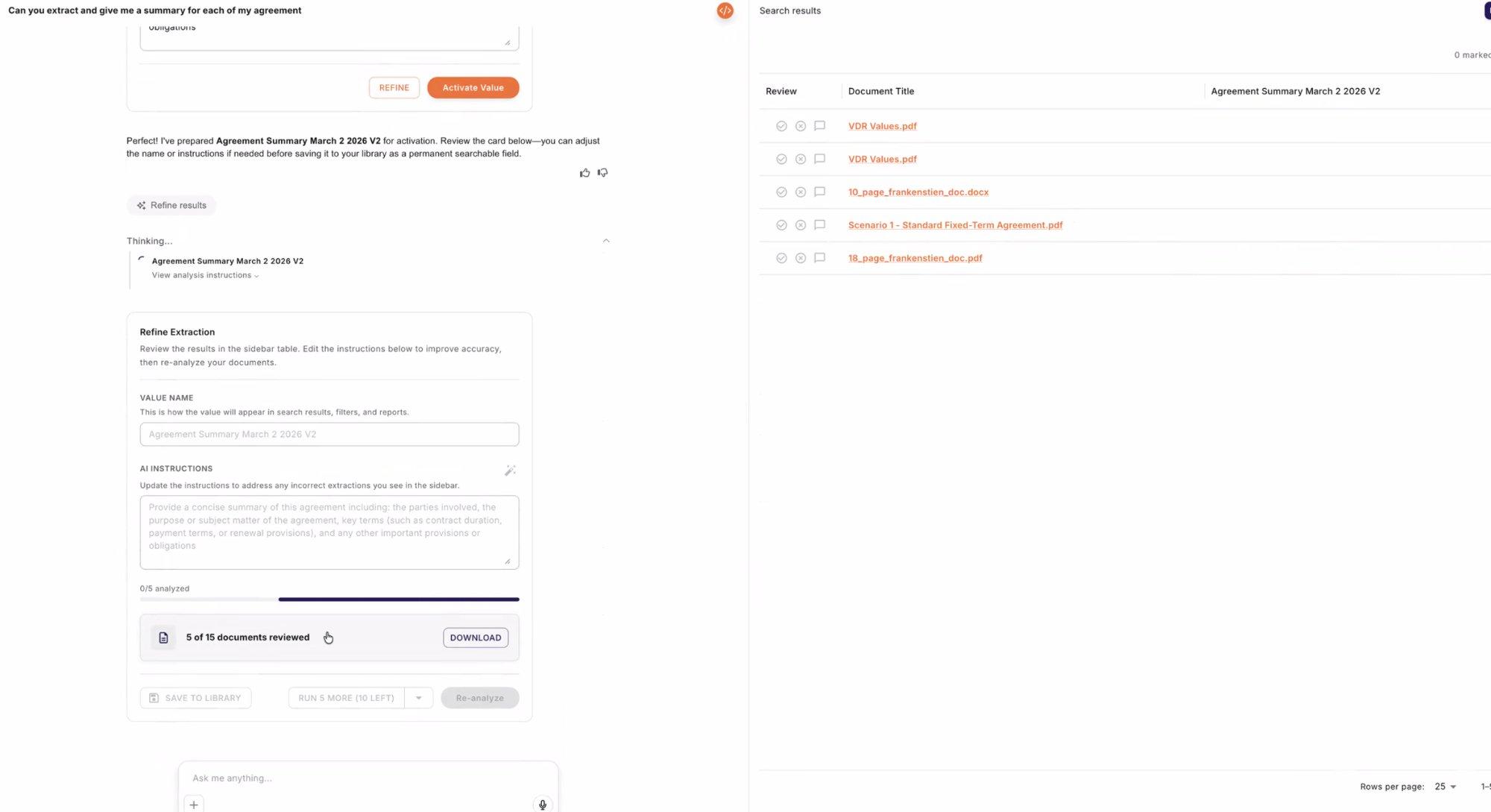
This was a working proof of concept built by engineering to validate the technology. That was useful, but it surfaced a newer UX challenge. AI tools now make it possible for almost anyone to build a convincing prototype quickly, so an early implementation can start to look like the product direction before the interaction has really been designed.
In this version, the user had to configure the extraction, review several previews, give feedback, and save the field before receiving the answer they originally came for. The technology worked, but the sequence was testing whether users could complete setup, not whether the answer was valuable. My role was to separate the technical proof from the product experience and test the most basic risk: could a legal user reach the answer without help?
Ship the setup-first proof of concept and learn from customers.
Could a legal user reach the answer without help?
Our VP of Legal stopped during setup and could not complete the task.
I asked our VP of Legal to use the existing flow with a real question. He stopped during setup and never reached the answer. That gave us evidence that the workflow itself was blocking the product's core value, and it changed the conversation from “ship it and learn” to “we need to fix the interaction before launch.” This was no longer a disagreement about which design was better. From there, I defined the key assumption the redesign needed to prove.
I started with these rough concepts to compare where the answer and results could live. But the bigger design question was not just where the table went. It was what the whole interaction felt like after someone typed a question. Even one AI input had a lot of states: submitting the question, waiting for the first result, deciding whether to run deeper analysis, watching progress, handling errors, and reviewing the final answer.
Earlier in my career I would have explored a workflow like this by drawing a series of wireframes. But AI products have many more states than a typical interface. The response might stream in gradually, take longer than expected, return partial information, fail, or move in a completely different direction depending on the question. Static screens were not enough to evaluate that.
So I moved into Figma Make early and built working prototypes instead. That let me type a real question, experience the waiting time, watch the results appear, and move through the different branches of the flow. It let me compare concepts much faster and catch interaction problems that would have been difficult to see in a wireframe. On this project it helped me quickly test whether results should appear directly in the conversation or behind a separate action. Rapid prototyping became a way to make better product decisions earlier, before the team invested in building the wrong interaction.
| Option | Pros | Cons |
|---|---|---|
| In the chat | Familiar | Buries the conversation |
| Side panel ★ | Answer and evidence together | A bit more UI |
| View results | Clean | Delays the value |
The side panel had one clear tradeoff: it added more interface. I made it collapsible so the amount of UI could change depending on what the user needed. When someone needed to compare several contracts, the panel could stay open beside the answer. When they only needed the response, they could collapse it and focus on the conversation. That gave users quick access to the evidence without forcing a large table into every interaction.
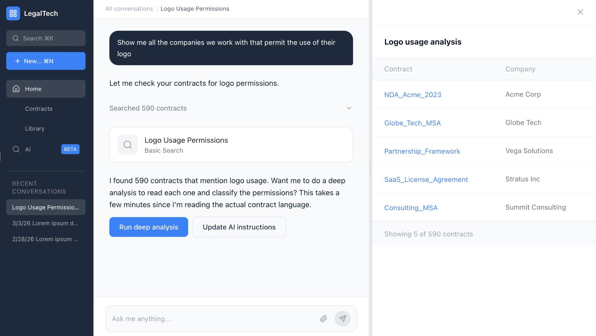
The biggest design decision was separating fast search from deep analysis. A fast search could quickly tell the user that 590 contracts mentioned logo usage. That was useful context, but it was not the legal answer. To determine which agreements actually granted permission, the system had to read and classify those contracts. That required more time and compute.
I added a decision point between those stages. The product showed what it found, explained what deeper analysis would do, and let the user adjust the instructions or continue. Once they confirmed, the deeper analysis began and progress streamed into the interface.
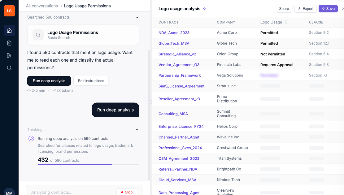
The first response gives the user useful information quickly. It shows how many contracts may be relevant, but it does not pretend those mentions already answer the question. The user can then choose whether to run deeper analysis. Before they commit, they can see the expected time and token usage and edit the analysis instructions. After confirmation, the interface shows progress while the contracts are processed. The final response gives the actual classified answer, with the supporting contracts and clauses beside it. Saving stays optional until the user knows the analysis is worth reusing.
Once the answer-first flow was clear, I refined the details that made it feel responsive and trustworthy. Results streamed into the table as they were classified, so users could see progress instead of waiting on a blank screen. I added a Stop control so they could end an unhelpful run and avoid unnecessary processing. And I kept the source evidence close to the answer, reusing our design-system and Material Design patterns so the experience felt consistent with the rest of the product.
| Situation | Behavior |
|---|---|
| Broad matches found | Show the number of potentially relevant contracts |
| Interpretation required | Explain that the first pass is not the final answer |
| Before deep analysis | Show expected time and token usage |
| No results | A named empty state, never a blank table |
| Missing citation | Mark Needs review, never confident |
| Mention only | Exclude, don't fake a match |
| Stop clicked | Cancel the run, keep what streamed |
The main screen was only part of the design. I also defined how the product should behave across different states. The first pass could show potential matches, but it needed to be clear that those matches had not been interpreted yet. Before deeper analysis, the product had to explain what it was going to do and what it would cost. During the run, it needed to show progress instead of leaving the user with a long loading state. I also defined what should happen when there was no result, a missing citation, a failed extraction, or a document that mentioned the topic without actually answering the question.
A major engineering decision was separating fast retrieval from deeper analysis. Retrieval could quickly identify contracts that might be relevant. Deep analysis required the model to read each contract, interpret the language, and classify the result. Instead of hiding that constraint, I made it part of the interaction. I worked with engineering and data science on the transition between those stages, the progress behavior, token limits, cancellation, partial results, failed extractions, and the difference between something being excluded and something not being found.
I also did not design LinkAI as a disconnected, one-off experience. I reused our existing components and Material Design patterns, then extended them with AI-specific behaviors like streaming progress, an interruptible run, source-linked answers, and clear review states. Documenting those rules and edge cases meant engineering was not making product decisions state by state during implementation, and the source-linked answer pattern later informed other AI experiences across the product.
Once I had the answer-first direction, I needed to validate it quickly because the launch timeline had moved up. In under a week I turned the concept into a working prototype, created the test plan, and ran sessions with legal professionals. I focused the study on the riskiest question: could someone ask a real legal question, understand the first result, continue through the deeper review, and verify the final answer against the contract?
Participants reached the answer without assistance, which gave us confidence that the new interaction model worked. But the tests also showed that completion was not enough. Users needed direct access to the supporting clause, and the product needed clearer logic for when a contract actually answered the question versus merely mentioning the topic. I turned both findings into launch requirements before engineering finished the experience.
“I just want my damn answer.”
“Yes! This is it, this is the behavior I expected all along.”
Our VP of Legal reacted strongly to the first workflow, so I brought him back once the redesign was working. His response completely changed. That showed we had addressed the concern that originally put the direction at risk, and it gave a key stakeholder confidence in what the team was building.
Closing that loop meant we could move forward with alignment instead of asking people to trust a design decision they had not seen evolve. It kept an important stakeholder supportive as the team moved toward launch.
Because retention would take time to measure, I identified earlier signs we could watch. I would ask the team to track how quickly users reached an answer, whether they completed the analysis, whether they checked the source, and whether they came back to use it again. That would tell us whether the feature was creating repeatable value before we had longer-term retention data.
The redesign removed several setup steps before the user saw anything useful. All four legal professionals completed the new flow without help, and the testing surfaced two trust requirements we needed before launch. Since the external beta customers were not ready, I tested with our internal legal team instead of waiting. That gave engineering a tested flow and clear requirements for citations, source verification, intent matching, and uncertainty. The redesigned direction reached production in March 2026.
Used real customer questions to narrow a broad AI initiative to direct question-and-answer.
Demonstrated the setup-first problem and validated an answer-first alternative in under a week.
Defined the flow, trust rules, and edge cases with engineering and data science.
Source-linked answers gave the broader product team a way to make other AI experiences easier to verify.
I used real customer questions to narrow a broad AI initiative into a focused question-and-answer experience. When the first prototype put setup before value, I demonstrated the problem and validated an answer-first alternative in under a week. I then worked with engineering and data science to define the interaction, trust rules, and edge cases needed to build it.
The source-linked answer pattern also gave the broader product team a reusable way to make other AI experiences easier to verify. Overall, I helped the team move forward with a clearer direction, stronger evidence, and less launch risk.
I recognized that the proposed workflow would test the wrong behavior, found evidence, redesigned the underlying interaction model, and translated the new direction into something engineering could ship.
I started by figuring out what customers were actually asking the AI to do. I found that the first workflow made the value too hard to reach, tested that risk, and brought the team a different direction. Then I turned that direction into a flow we could test and a set of behaviors engineering could build.