01 · Overview
Turning an ambiguous product question into a clear direction
The team faced an open product question. The LinkSquares homepage was an AI-prompt-first screen, an open input box similar to ChatGPT, and no one was confident it was the right first thing legal users should see. I led a two-part study, a workflow survey followed by moderated concept testing, to understand whether users needed a search/AI entry point or a personal work queue. The research gave the team directional evidence and a recommendation to move toward a task-oriented "My Work" model, defined what that surface needed to help users do, and reduced ambiguity before further engineering investment.
- →3 of 4 participants preferred a task-oriented homepage over an AI/search entry point, a directional signal from a small qualitative concept test.
- →Made the case to reframe an in-flight homepage direction from "AI prompt" to "daily work queue," reducing ambiguity before further engineering investment.
- →Defined what the homepage needed to do and produced a prototype and validation plan for the next step.
Methodology note
This was a small qualitative study with 4 legal professionals. The goal was not statistical certainty; it was to identify directional patterns, uncover decision criteria, and reduce ambiguity before the team invested in a homepage direction. The findings were treated as evidence for the next prototype, not final proof.
02 · Problem
A generic AI prompt as the homepage. Was it right?
At the time, the LinkSquares homepage was a generic AI input box, similar to ChatGPT or Claude's landing page, with a few suggested prompts to get legal users started. The product team wasn't sure this was the right direction.
03 · Discovery
A card sort, then a workflow survey
My team and I had just completed a card sort that revealed something interesting: a large number of users independently created a "My Work" section when organizing the product's information architecture. Because so many people had surfaced this concept unprompted, the question became clear: should "My Work" be the homepage? And if so, what should it contain?
That's where I came in. I designed and ran a two-part research study to find out.
The survey
Part one was a survey about current workflows: where do you start your day, how do you figure out what's urgent, what causes things to slip through the cracks?
Results
3 of 4 survey respondents start their day in email. Not in a dashboard, not in a project management tool. Email. From there, they manually piece together what needs attention by checking Slack, shared drives, and their own memory. They aren't starting from zero each morning: they already have a running list of work. But figuring out what's urgent is entirely reactive.
Every single respondent said they find out something is urgent because another person follows up asking about it. Not a notification, not a dashboard flag: a human chasing them down. And half said it takes them 10 to 30 minutes just to orient themselves at the start of the day, checking multiple places to piece together their priorities.
This was a strong signal for consolidation: one place that pulls everything together so users stop hunting across tools. But the data also revealed a split in how people prioritize. 2 of 4 prioritize by nearest deadline, 1 by whoever is actively waiting, 1 by highest-value contract. The homepage would need to surface all three signals and let users apply their own logic.
Two distinct jobs emerged from the research:
04 · Process
Designing two concepts to surface a real choice
I designed two concepts intentionally far apart: one bet on data completeness, the other on prioritization. Pushing them this far apart forced participants to pick a mental model instead of splitting the difference.
I built both at high fidelity. Legal users don't engage with rough mocks the way they engage with something that looks like a real product, and I wanted reactions to the structural choice, not the abstract idea of one.
For the test I ran a moderated concept test with four legal professionals, opening with: "You just opened LinkSquares. What do you do first?" An open prompt surfaces what users actually do, not what they'd say they prefer.
Results
Concept B was the clear favorite (3 of 4 participants), and 3 of 4 participants said they would trust it as a daily starting point (vs. 1 of 4 for Concept A). But the more interesting data was in the details of how each concept performed.
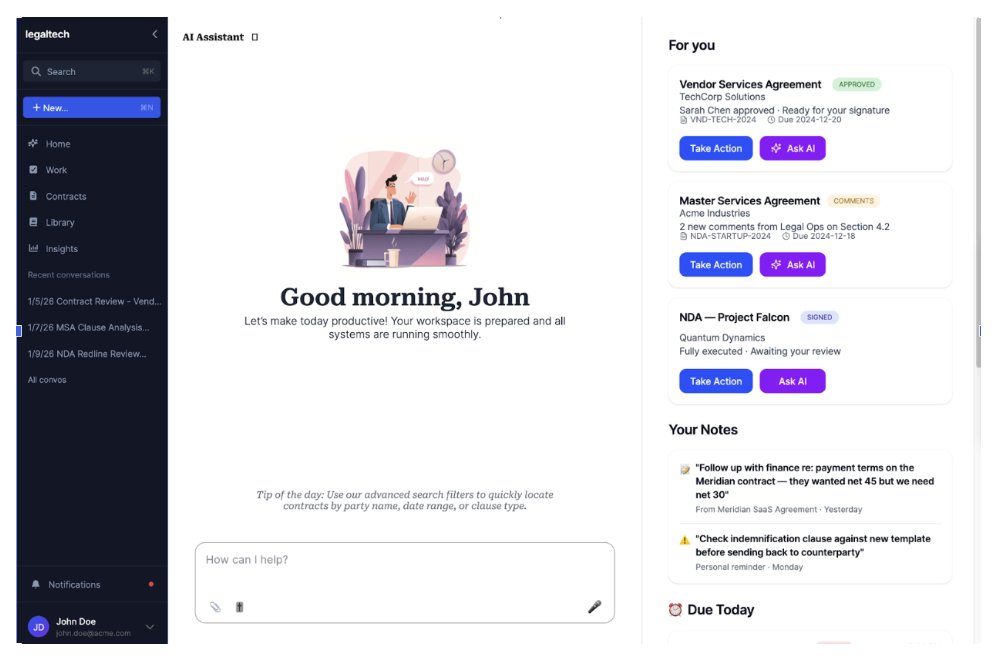
The greeting buried the actionable stuff Concept A insight
3 of 4 participants noticed the greeting first; only 1 noticed the items needing attention. The "Good morning" message took up prime real estate without helping users orient. The actionable content was in a sidebar that felt secondary.
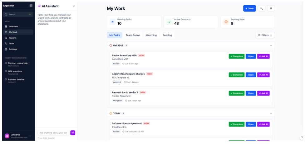
Urgency leading the page built trust Concept B insight
2 of 4 participants noticed the Overdue section first. Attention went to actionable items, not decorative elements. 3 of 4 participants knew to click Team Inbox to check on a colleague's urgent work: team visibility was intuitive.
Users wanted more context per item Both concepts
Across both concepts, users asked for: one-sentence AI summaries of agreements, points of contact ("I differentiate contracts by their point of contact"), what's needed to complete overdue items, and dollar value for prioritization.
Where does the AI assistant fit in?
Both concepts included an AI assistant, but positioned differently. Concept A had it always visible as a sidebar. Concept B had it as a collapsible panel. 3 of 4 participants preferred the collapsible approach.
The reasoning was practical, and it pointed to a deeper product insight. Users didn't want less AI; they wanted it embedded into the work itself, one-sentence summaries, urgency signals, and context attached to each contract, rather than a chatbot occupying the workspace they needed for triage. AI should be accessible, not ambient: available the moment they have a question, invisible when they don't.
AI-driven urgency
Beyond the chatbot, I tested a second AI concept: could AI flag which contracts need attention most urgently? I asked participants if they would trust an AI system telling them something was a priority. The answer was nuanced.
All participants said they would want AI-driven urgency flags, but with clear conditions. They needed the ability to dismiss AI suggestions ("not urgent"), edit priority levels, and still manually mark items as important themselves. Trust in AI prioritization wasn't binary: it was conditional on user control.
Design decision
"Users wanted AI summaries on their task items: 'tell me what this agreement is about in one sentence so I can prioritize.' They didn't want an AI chatbot taking up half the page while they're trying to triage their morning."
What I measured
With a small sample, I focused on decision criteria and mental models rather than statistical outcomes. Across the survey and concept test I looked at:
- →Concept preference, task queue versus an AI/search entry point.
- →Trust in the homepage as a daily starting point.
- →What users noticed first on each screen.
- →How users prioritize work: deadline, who's actively waiting, dollar value.
- →Where AI felt helpful versus where it felt distracting.
05 · Solution
A task-oriented homepage with customizable data points
From the research, I built a prototype that combined the strongest elements of both concepts: Concept B's urgency-first structure with Concept A's notes and richer context. Urgency leads the page. A "Needs your action" list pulls everything overdue or due today to the top so users don't have to scroll to find what's slipping. Underneath sits a row of customizable tiles, meant to surface the signals people use to prioritize their day.
I made the dashboard top customizable for two reasons. First, the survey showed people prioritize differently (2 of 4 by nearest deadline, 1 by who's actively waiting, 1 by highest-value contract), so no single fixed layout serves everyone. Second, LinkSquares was planning to sell the product in different configurations: some customers wouldn't have the full CLM, others might buy only the AI features. A homepage built from show, hide, and reorder blocks can adapt to what each customer actually owns, rather than assuming one feature set.
The specific blocks in the prototype, summary tiles, pipeline by status, workload by owner, the deadlines chart, and the action list, are illustrative rather than a finalized set. Which blocks to offer, and whether something like total contract value belongs at all, is an open question I'd settle with more research before building.
The AI assistant landed where users wanted it: as a collapsible panel, not an always-visible sidebar. Per-item context that came up across both concepts (one-sentence AI summaries, point of contact, dollar value) was baked into every contract row.
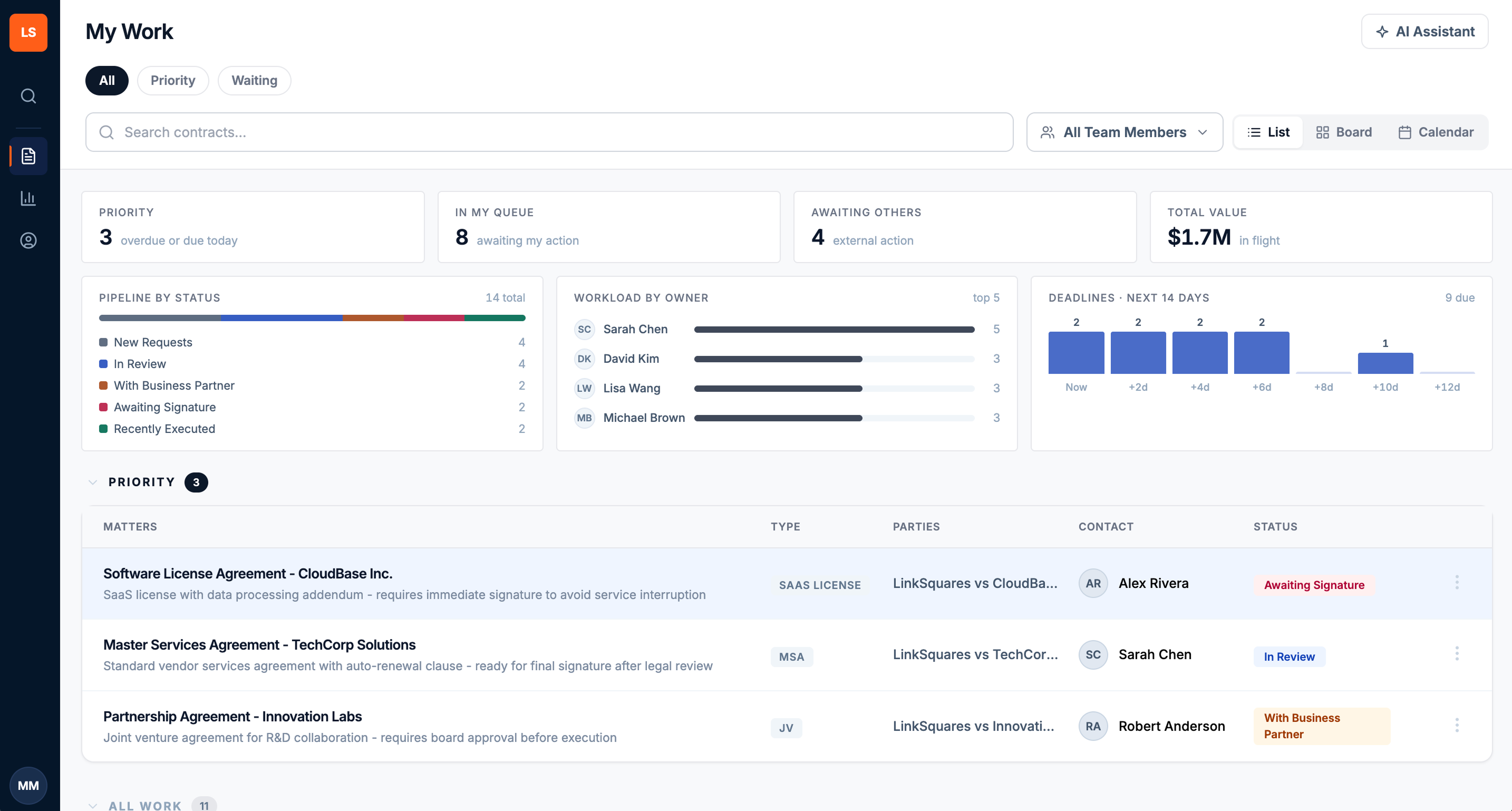
The prototype: a "Needs your action" list at top, customizable summary tiles and charts below, contract rows with AI summary and point of contact.
Research outcome
A strategic outcome, not a launch metric
This was early discovery and concept validation, so there are no post-launch usage metrics to report. Its value was strategic: it gave the team the evidence to make a direction call early, while change was still cheap.
- →Made the case for moving away from an AI-prompt-first homepage toward a task-oriented work surface, before further engineering investment.
- →Defined what the homepage needed to help users do: identify urgent work, understand why something matters, and reach AI only when it supports triage.
- →Gave the team a clearer prototype and a concrete validation plan for the next step.
My design team aligned that a task-oriented "My Work" homepage was the right direction. That call wasn't fully resolved at the leadership level before I rolled off the project, so I handed off the research and prototype as the basis for the decision. That's the honest shape of a lot of discovery work: you reduce the risk and equip the team to decide, even when you don't get to see it ship.
06 · Reflection
What I'd do next
The strongest signal was that 3 of 4 participants wanted a personal work queue as their first screen, so a task-oriented homepage was the right default for users on the full workflow product. But I pushed the team on a related point, one that came from where the product was heading rather than from this study. LinkSquares was planning to sell the product in different packages, including an AI-only configuration. A customer who only buys AI has no work queue to populate, so their first screen probably shouldn't be an empty task surface, it should be the conversation. The homepage couldn't be one-size-fits-all; it would need to flex to what each customer actually owns, the same entitlement logic behind the customizable blocks.
The next step is task-based validation, not more preference testing. Preference tells you what users say they like; it doesn't tell you whether the design helps them work. The next study should test whether the redesigned homepage helps users identify their highest-priority work faster, and whether the customization that tested well actually helps or quietly introduces friction.
What I'd measure next
- →Time to identify the highest-priority work.
- →First action taken from the homepage.
- →Task completion from the homepage.
- →Daily and weekly homepage engagement.
- →Dismiss and edit rates for AI-prioritized suggestions.
- →Whether users rely less on email as their starting point.